
Light, History, and Going All In: Q3 Press Coverage

Every room I design for my clients starts with a question, and it’s never “what’s trending?”
Instead, I consider questions like: Who lives here, and how does this home need to support them? What does the light do at 4:00 in the afternoon? What’s the story of this house?
Those questions become the source of my design inspiration, and Q3 gave me multiple opportunities to talk about how I arrive at them.
The Advocate
The Advocate asked a group of Baton Rouge designers (including yours truly) about color, and I got to share something I believe deeply, that there is no one-size-fits-all color. Every palette our team creates is built from scratch around a specific home and the people who live in it.

The one thing I do encourage across the board is bravery. Almost every client arrives with a real desire for color and a quiet fear of getting it wrong. My job is to build a palette with enough thought behind it that they can stop second-guessing and just enjoy it.
In this feature, I was also asked about trends, and my honest answer is that I keep a close eye on what’s trending nationally so I know when to steer clients away from it. Nothing ages a beautiful room faster than a trend that peaks and fades within a year. Pantone’s color of the year is a good example. In my experience, it takes two to three years to trickle down to big-box stores, and by the time it’s everywhere, the design world has already moved on.
The Advocate (Round Two)
Paint doesn’t look the same everywhere, and that’s something I think about on every project.
In a second feature, The Advocate asked how Baton Rouge’s light and architecture change what works here. We don’t have the bright, bouncy coastal light or the glass high-rises we’ve designed in some other markets, so I rely heavily on my training in the science of color and lighting to get paint to do what I want it to in our clients’ homes.
My one piece of advice for any homeowner is to add windows anywhere you possibly can, including powder rooms and closets. Natural light changes everything.

I also shared where I’ve been finding inspiration lately and my prediction that we’ll be done with butter yellow and powdery pastels before long, and instead, we’ll swing toward richer tones like butterscotch, rust, forest green, and navy. Trend cycles are frequently about extremes.
The Spruce
When The Spruce asked designers which paint colors they’d happily use again and again, I had two answers: Copenhagen Roof and Duck Green, both from Farrow & Ball.
Copenhagen Roof is a poppy red that makes a very strong statement, and we used it in a foyer to set the tone for the entire house. Warm cream on the trim and ceiling kept it feeling crisp and expensive. Duck Green is a rich, enveloping green that looks incredibly sophisticated when a whole room is drenched in it, especially paired with chocolate and toffee browns.

But the part I’d want you to take away isn’t the paint colors. It’s that if you’re going to commit to colors this bold, you have to go all in. What creates regret is when you get right up to the line, and you start rethinking everything. An idea only works if you follow through.
Currey & Company

This summer, I designed a room in the 2026 Mobile Bay Inspiration Home, and Currey & Company, whose lighting and accessories were featured in the space, interviewed me about it. (If you missed our full post on the showhouse, you can read it here.)
The room I was asked to design was the Front Parlor, and its theme came straight from history. In the Gilded Age, a dedicated room for exotic plants was a way to show off that you had the money and the heat to keep something tropical alive through the winter. I wanted that same wink without turning the room into an actual greenhouse, so a palm leaf chandelier became the centerpiece.
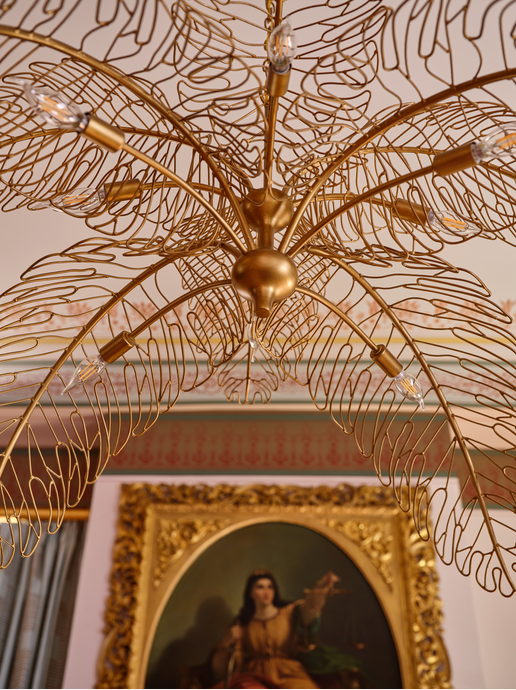
History isn’t a garnish for me. Design and architectural history were core to my degree (I minored in art history), and now most of what I do is instinctual. The trick is remembering to explain those choices to clients so they understand the full context of their design.
A room where everything matches in period or style reads as staged. In a modern home, it looks like a model home, and in a historic one, it looks like a museum. Mixing eras creates tension, and tension is what makes a room interesting. In the parlor, that meant an antique mirror paired with a very modern cocktail table, and a palm leaf chandelier hanging among hand-stenciled ceilings.
My favorite part is that we sourced nearly all the artwork locally in Mobile on installation day. Once the furniture was in place, we scouted stores and galleries and found incredible oil paintings in equally gorgeous frames. I love having a plan for every inch of a room, but saving a little time and space for things to evolve is a delight.
More to Come
We’ve been sharing our 2026 press features as a quarterly series this year. If you missed our earlier roundups, you can find Q1 here and Q2 here. Q4 is still to come, so stay tuned before the year is out!


Comments