
Seen and Heard: Q1 Press Coverage

My obsession with color has been long and well-documented, and naturally, it's at the forefront of how I approach design. Color is not just an accent or a finishing touch. It's an intentional decision and deeply rooted in everything I do.
So when I look back at RCL Interior's press features from the first quarter of 2026, I'm not surprised that every single one of them circles back to the same thing: color.
Designers Today
When Designers Today asked a group of interior designers to name their color of 2026, I didn't hesitate. Bright, poppy red. British red. Fire engine red.
My exact quote was, "It brings warmth and sophistication without the heaviness of darker jewel tones. We've been living in this beige and white cocoon for so long that color feels electrifying."
I stand by every word. And the rest of Q1 gave me plenty of opportunities to prove it.
InRegister
In February, InRegister ran a full feature on our client’s home that included a complete gut renovation. The client’s brief for the project was essentially "Carrie Bradshaw, but make it a home."
She wanted nothing beige, basic, or humdrum in her new space. Those words were music to my ears!
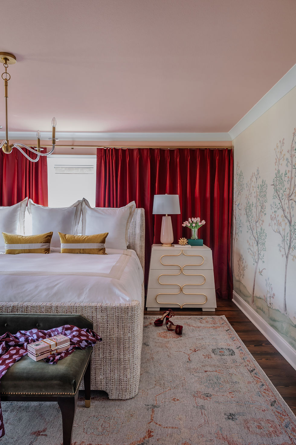
The entire color story unfolded from a single grasscloth mural wall covering in the primary bedroom, and every shade in the home was pulled from that one element.

We added a raspberry velvet sofa, pink walls, jewel tones, and even a curved brass hood in the kitchen that started as a wild pitch and immediately became a non-negotiable. The result was a home that felt fearless, feminine, and polished.

What I said then (and still believe) is that the success of any project depends on a client who wants to be pushed, a designer who can organize bold ideas into something buildable, and a contractor who leads with yes.
On this project, all three were firing at once. That kind of alignment is rare, but when it happens, the results show it.
225 Baton Rouge
A feature in 225 Baton Rouge followed the transformation of a home office for Kristyn Starkovich, then co-founder of Rivalry Communications Coaching, and now founder of Signal Coaching, and it's one of my favorite examples of color enveloping a space.
The brief was simple. She wanted color-saturated, bold, feminine, and purposeful. What had been an oatmeal-colored guestroom became an orchid-hued workspace anchored by custom built-in bookcases, a chaise lounge, and a soft lavender ceiling.

Warm coral and tangerine accents, deep grasscloth, and custom furnishings came together to create a space that doesn't just look good. It functions differently because of how it looks.

Kristyn loves that the finished office gives her clients a space to let their guard down. In fact, she loved it so much that when she founded her new coaching business, Signal Coaching, the color palette became the foundation of her branding! That's what intentional design does. It doesn't just house what you do; it helps you do it better.
Parade Home and Garden
Rounding out Q1 was a feature in Parade Home and Garden, which included RCL in a mudroom roundup. It's the least glamorous room in the house and arguably one of the hardest to get right because it has to work every single day.
However, we treat it with the same intention as every other space. The result was a multifunctional mudroom with a dedicated pet nook and laundry room, proving practical and beautiful don't have to be at odds.

More to Come
Q1 was just the beginning of the fantastic features we have been honored to be a part of in 2026. We'll be sharing our Q2, Q3, and Q4 press features over the next few months, so stay tuned. There's plenty more to come before the year is over!


Comments