
The Psychology of Color for the Office - Part 1
- May 12, 2025
- 3 min read
Updated: May 19, 2025
For the introvert, home is not merely shelter but sanctuary: a place that must actively support both productive focus and restorative calm. Color, more than any other design element, directly influences our neurological and emotional states, making it the most powerful tool in creating spaces that work with rather than against our natural tendencies.
Beyond Personal Preference: The Neuropsychology of Color

While individual associations with colors matter, certain neurological responses transcend preference. Understanding these biological foundations allows us to make informed choices rather than merely decorative ones:
Blue wavelengths stimulate the production of cortisol, promoting alertness and focus, ideal for daytime work spaces
Red environments have been shown to improve performance on detail-oriented tasks but can increase stress hormones with prolonged exposure
Green viewing requires no adjustment by the eye, creating the least strain during extended visual focus (this is why surgeons wear green scrubs! It’s a nice break from staring into the body cavity with its - I’m sorry to be so blunt - blood and guts)
Yellow stimulates the production of serotonin but can create visual fatigue more quickly than other colors
The Focus Zone: Coloring My Home Office for Productivity
For professionals who require deep concentration, the home office presents a unique opportunity to create an environment optimized for cognitive performance. Here, color selection should prioritize mental clarity, reduced eye strain, and sustained attention.
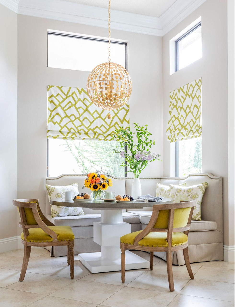
Wall Colors: Strategic Selections for Focus and Energy

Rather than thinking in terms of primary and accent walls, consider the entire room as an integrated color experience. Different hues can promote distinct cognitive states, allowing you to select colors that align with my specific work requirements:
For Analytical Work and Sustained Concentration:
Benjamin Moore "Glass Slipper" offers a balanced blue with subtle gray undertones that supports logical thinking
Farrow & Ball "Green Smoke" provides a deep, complex green that reduces eye strain while maintaining alertness
Benjamin Moore "Whale Gray" creates a sophisticated neutral backdrop with enough depth to avoid the starkness of white
For Creative Thinking and Conceptual Work:
Benjamin Moore "Peony" a subdued rose tone that stimulates creative thinking without overwhelming the senses
Farrow & Ball "Setting Plaster" a nuanced terracotta that promotes warmth and imaginative thought
Benjamin Moore "Iced Marble" a complex lavender-gray that research links to increased problem-solving abilities
For Balance Between Analysis and Creativity:
Benjamin Moore "Yorktowne Green" a deeply saturated teal that bridges logical and creative thinking
Farrow & Ball "Dead Salmon" (despite its unfortunate name) a sophisticated pinkish-beige that promotes both focus and openness
Benjamin Moore "Wethersfield Moss" a muted olive that provides grounding while supporting flexible thinking
When applying these colors, consider a matte or eggshell finish rather than high-gloss options. Glossier finishes can create distracting reflections during video calls or when working with multiple screens.
Designer's Note: For video conference backgrounds, avoid pure white walls which create harsh contrasts on camera. Instead, select colors with subtle complexity that complement my skin tone while providing a professional appearance on screen.
This post is just the beginning of our new series exploring the psychological aspects of interior design through color. Next week, we'll explore flooring, textiles, and the impact of light.
Ready to develop a color strategy that enhances my focus and productivity? Schedule a consultation to discover how our evidence-based approach to color can transform my work-from-home experience.


Comments