
Misunderstood Monsters: The Colors of Halloween
- Oct 27, 2025
- 3 min read

I will be the first to tell you that, from an aesthetic perspective, Halloween is my least favorite holiday. The glorification of all things macabre is a little too gruesome for my delicate heart. As a child of the 80s, I grew up actively avoiding the horror movies my friends seemed to love - Nightmare on Elm Street, Halloween, Texas Chainsaw Massacre, Poltergeist - and to this day, I still haven’t seen them (or others like them), and I never plan to.
I’m more inclined to decorate my porch for “fall” with pumpkins and haystacks and watch a psychological thriller or listen to a true crime podcast where I can deep dive into the “why” of a killer’s psyche.
Fortunately, in recent years, Halloween has had a bit of a glow-up. More family- and kid-friendly options have made it to market, and the new color palette of the scariest holiday is much more gentle than what I grew up with. Even the villains in scary movies are given the benefit of an origin story now. (They’re terrible because someone was terrible to them! In fact, one of my favorite podcasts, aptly named Killer Psyche, is a fascinating deep dive on the childhoods of many of the most infamous of criminals.)
So, in the spirit of changing your mind about something, let’s talk about the misfits of the color world. I can’t help but notice how these three bold hues get their brief, annual moment in the spotlight, only to be packed away with the costume boxes come November 1st. But just like the misunderstood monsters that haunt the movies I refuse to watch, orange, black, and purple are far more nuanced than their spooky reputations suggest.
Orange: The Warm Welcome

Orange often gets relegated to pumpkins and candy corn, but this vibrant hue is actually one of the most inviting colors in the design spectrum. It’s the color of terracotta sunsets, autumn leaves, and crackling fires. In interior spaces, orange brings warmth and energy without the intensity of red or the caution of yellow. It’s friendly, it’s optimistic, and it pairs beautifully with natural woods, deep blues, and crisp whites.
From a burnt sienna accent wall to coral cushions, orange has a range that extends far beyond October 31st. Using a color doesn’t mean it has to go on the walls—that’s usually the first place we think of when we consider whether we like a color for interiors. I agree, orange walls would be a bit much even for me. But look how stunning it is in our clients’ living room!
Black: The Sophisticated Statement

Black has been unfairly typecast as dark and dreary when it’s actually the ultimate sophistication in design. It grounds a space, adds definition, and makes every other color in the room look more intentional. Black frames, fixtures, and furnishings create contrast and drama in the best possible way. It’s the little black dress of interior design—timeless, elegant, and endlessly versatile. Whether it’s matte black hardware, a charcoal accent wall, or ebony furniture pieces, black brings a level of polish that lighter palettes simply can’t achieve alone. This primary bedroom features walls upholstered in black flannel, creating a cocoon-like effect for this client.
Purple: The Regal Risk-Taker

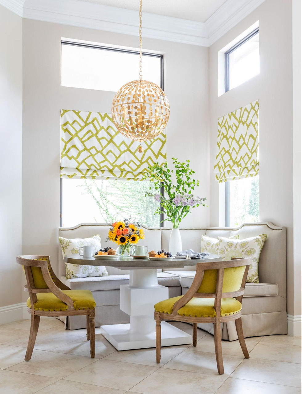
Perhaps the most misunderstood of the trio, purple suffers from being seen as “too much”—too bold, too eccentric, too risky. But purple spans an incredible spectrum from soft lavender to deep eggplant, and each shade tells a different story. Lighter purples bring serenity and creativity to a space, while deeper tones add richness and luxury. Purple has historically been associated with royalty for good reason—it commands attention while remaining refined. In the right context, it can be surprisingly neutral, playing well with greens and even unexpected partners like mustard or coral. It’s certainly one of my favorite colors!
Giving Bold Colors Their Moment

These colors only seem intimidating because we’ve been conditioned to see them as “occasional use only” shades. Great design is about breaking free from arbitrary rules and trusting what makes a space feel alive. Orange, black, and purple, whether separately or thoughtfully combined, can create rooms that are warm, sophisticated, and entirely livable. Having the confidence to work with bold colors opens up a world of possibilities for spaces that feel uniquely, unapologetically yours.
So this Halloween, as you’re surrounded by these hues, take a moment to appreciate them beyond the holiday context. I hope you’ll consider giving these misunderstood monsters a permanent home in your design palette.
Happy Halloween from Team RCL!


Comments