
My 2025 Color Forecast
- Mar 3, 2025
- 3 min read
Saying Goodbye to Beige
While wandering the streets of Paris during Déco Off last month, I couldn't help but notice certain colors calling out to me from every direction — from chic Parisian outfits to the latest fabric collections. If you caught InRegister's recent piece featuring my observations, you know that 2025 is shaping up to be anything but beige!
Today, I'm expanding on those predictions and sharing why these colors might be exactly what your space needs as we move away from the “safe” neutrals that have dominated design in recent years.
Easy Green: Nature's Sophistication

Green swept through Paris like a fresh spring breeze, appearing on everything from tailored coats to luxurious textiles. This wasn't just any green — it's a specific verdant shade that sits perfectly between earthy and electric, making it both bold and surprisingly versatile.

In the showrooms, this hue appeared repeatedly — at Manuel Canovas paired with rich textures, and at Jim Thompson alongside unexpected blues and vibrant oranges. What makes this green special is its ability to be both statement-making and livable, bringing a sense of nature indoors without overwhelming a space.

Why it works: This shade of green connects us to nature while maintaining sophistication. In a world where we're increasingly tethered to screens, creating environments that ground us has never been more important. Consider this green for:
A welcoming dining room that encourages lingering conversations
A serene primary bedroom that balances vibrancy with rest
Statement upholstery that enlivens neutral surroundings
Red Returns: Bold Energy

If there's one color that signals the definitive end of the "greige" era, it's the return of rich, unapologetic red. From Parisian café awnings to the plush velvets in textile houses, this fiery hue dominated the design landscape.
What's interesting about this revival is how it's being used — not as an accent, but as a confident primary color. This signals a collective desire to move away from playing it safe and toward spaces that energize and inspire.
Why it works: Red brings warmth, passion, and presence to any room. Its revival speaks to our craving for spaces that stimulate conversation and creativity. Consider this shade for:
A library or office where focus and energy are paramount
Dining spaces that encourage lively gatherings
Strategic accents in otherwise neutral rooms
Just Peachy: Warm Sophistication

Perhaps the most surprising trend was the abundance of peach and apricot tones rippling through Paris's design scene. These juicy, warm hues appeared everywhere from fabric collections to installations, marking a delectable shift from cold minimalism.
While Pantone highlighted "Peach Fuzz" as 2024's Color of the Year, what we're seeing now is an evolution — slightly deeper, more sophisticated iterations that feel both refined and welcoming.
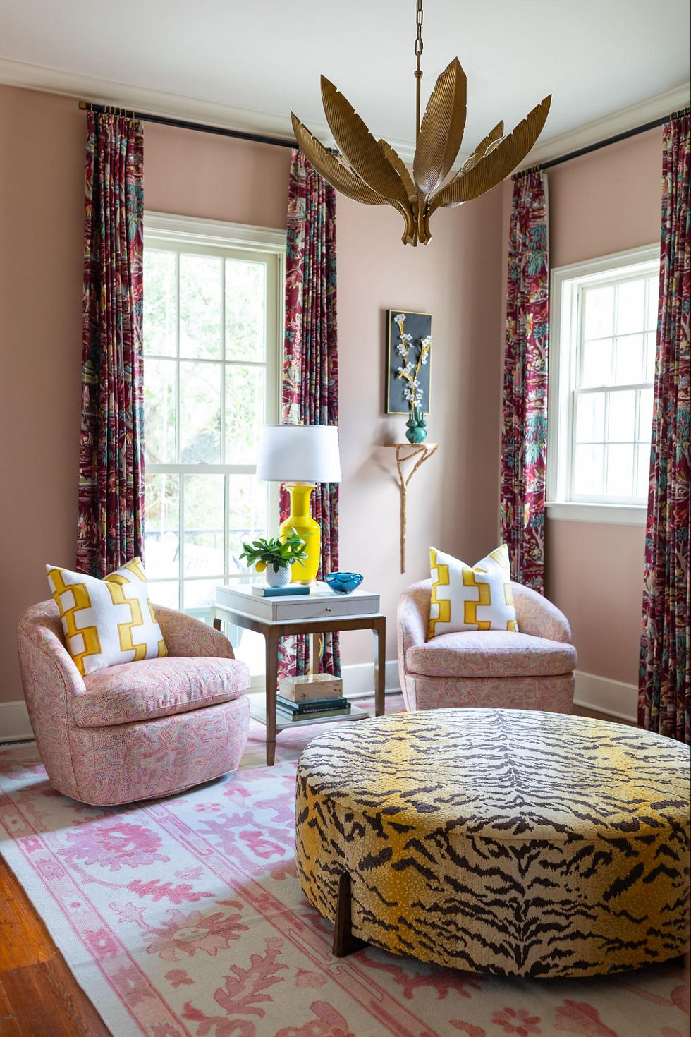
Why it works: These orange-tinged hues create an instant warmth that feels both current and timeless. They're surprisingly versatile, complementing both cool tones and other warm colors. Consider these shades for:
Living rooms that feel both elegant and approachable
Bedrooms that glow with gentle warmth
Quiet rooms that invite you to relax and reset from the day
Making These Colors Work For You
While trend-spotting is always fun, I'm a firm believer that your home should reflect your personal style above all else. The good news? These emerging colors offer something for everyone:
If you've been firmly in the neutral camp, these colors make excellent accents through pillows, art, or a single statement piece.
For the color-confident, these hues can transform an entire room when used on walls or larger furniture.
They all play beautifully with natural materials like wood, marble, and brass, making integration seamless.
What's most exciting about these color directions is how they signal a return to personality in our spaces. After years of safe, Instagram-friendly neutrals, we're embracing homes that feel distinctive and alive.
Ready to bring some of these fresh colors into your space? Schedule a complimentary discovery call to explore how we can help you introduce these trends in a way that feels authentically you.


Comments